

.png)

Branding
How to choose a marketing agency for B2B SaaS?
January 23, 2026

Your homepage is one connected argument, read top to bottom by someone deciding whether to trust you. Here is how to order it and write it.
.png)
Your site has a good hero, and the case studies are strong. Somebody spent money on the illustrations, and the pricing page answers every question a finance team could ask. Traffic arrives, but scroll depth dies somewhere around the third section. The demo form… stays quiet?
Every section on that page works on its own, but together they do not make a clear case. Nobody decided what to say first, so whoever opened Figma that week ended up setting the order. That order is a copy decision, but on most B2B sites, a copywriter never got to make it.
But before you read further, this blog is not about finding your message. If you have not settled what you say yet, start with our messaging framework for B2B tech and come back. This is about what happens to that message once it hits a live page, and to make sure that it hits well.
B2B website copywriting is the practice of ordering and writing the words on a page so a buying committee can follow one argument from headline to call to action. It differs from content writing because every section exists to move a single decision forward, not simply to inform.
That decision depends on the order, which is the part that usually gets skipped. A visitor reads in one direction, asking a different question at each scroll, and the sections are the answers. Put them in the wrong order and each answer is individually correct. But collectively? Useless.
Nielsen Norman Group put numbers on this a while ago and nothing since has made it kinder.
If a buyer reads a fifth of your page, the fifth they read has to be the argument.
Delete everything on the page except the H1 and the section headings, then read what is left. If you cannot tell what the page wants you to do, line editing will not save it. We call it the skim test and it takes about ninety seconds.
That ninety seconds is worth more than it used to be. An AI model will write you a full page of sections faster than you can read them, and the sentences will come out fine.
However, the structure of the page is where the model guesses. The model has never heard your sales calls and cannot judge what your team can deliver. When the website goes live, buyers leave without telling you what was unclear, and you never learn which deal you lost. Use the tools to get a draft up. Leave the judgment, the knowledge and the ninety-second check with the person who has to live with the result.
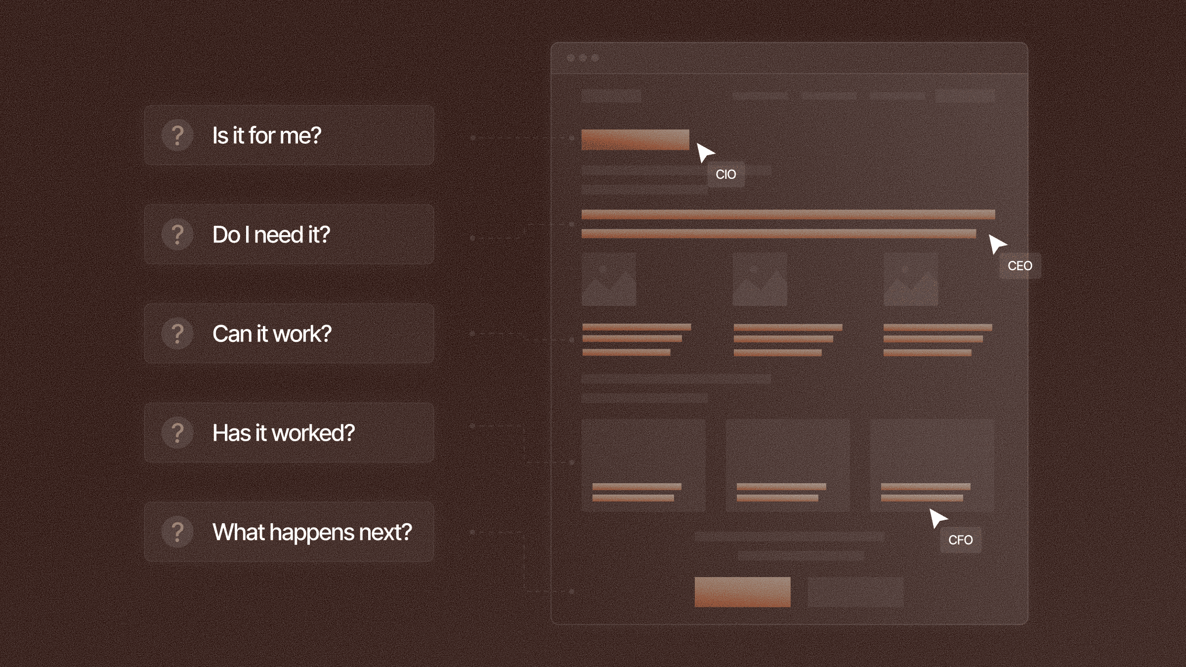
Effective B2B website copy gives each page one purpose and starts with what the buyer already knows. These six practices cover writing clear headings, placing proof beside claims, making your copy specific to your business, and connecting sections so readers can follow the argument and take the next step.
One page, one decision. Write the decision in a sentence before you write anything else, in the shape of "a Head of Growth at a Series A SaaS company books a call." Every section then has to earn its place against that sentence. Cut the ones that cannot.
This is where the sequence gets locked, and it happens earlier than most teams expect.
"Structure decides whether copy lands or leaks. We lock the storyline in wireframes - above-the-fold message, section sequence, proof placement, CTA - before anyone writes a sentence."
- Natalia Slota, Founder, Apricot Studio
The order below is for a homepage, where you have to make the whole case.
Pages other than the homepage pick the sequence up later, because the reader lands further along.
One more thing worth naming at this stage - the alternative your buyer is comparing you to is rarely the competitor you worry about. It is usually a spreadsheet or doing nothing for another quarter. If you have not checked, a competitor messaging analysis will tell you.
Awareness level decides the opener. Most B2B homepage traffic is solution-aware or product-aware, so three paragraphs on a problem the reader has already named will bore them into leaving. Lead with your value proposition for the aware majority and put the problem-and-stakes section just below the fold for the ones who need it.
Cold traffic from paid, arriving from an unaware audience, needs the problem first. Same company, different page, different opening. The mistake is running one opener everywhere.
How to tell which audience you have:
If they do, you are writing for solution-aware readers and you can skip the warm-up lap.
Getting this right matters. 6sense surveyed more than 4,000 B2B buyers in 2025, and they found that:
Your page needs to explain why you belong on the shortlist early on, rather than make buyers scroll through a problem they already understand.
Gartner surveyed 646 buyers over the same period, and discovered:
That means the copy needs to guide buyers through the offer, the evidence and the next step in a clear order, without relying on a salesperson to fill in the gaps. Your page is doing the selling, and it is doing it before anyone on your team knows the account exists.
Your headings are the storyline in compressed form. Every section heading should carry a claim with a verb and a specific noun, because headings are what people read on the way down. "Built for compliance teams" makes a clear point. "Features" is just a simple label, and it tells a skimming reader nothing.
Claim headings are longer than labels, so your designer will push back. Have that conversation at wireframe stage, while the layout can still change to fit the words.
Here is what the rewrite looks like on a real section. This is a composite of the pattern we see repeatedly on Series A and B sites.
BEFORE
Powerful integrations
Our platform integrates with the tools you already use, so your team can work the way they want to work. Connect your CRM, your data warehouse, and your favorite communication tools in just a few clicks.
AFTER
Your data lands in Salesforce before the call ends
Connect Salesforce, Snowflake and Slack once, and every call summary, transcript and next step is added to the right record within ninety seconds. Reps no longer need to retype notes.
Look at what the heading alone now does. "Powerful integrations" doesn’t communicate anything meaningful. "Your data lands in Salesforce before the call ends" gives them a claim they can picture and doubt, which is what makes them read the line underneath it. A reader who sees only your headings still gets the argument.
Proof placement beats proof volume. A logo bar in the hero earns general credibility, showing that you are established and known companies have worked with you, but nothing more. Doubt dies when a named result sits next to the claim that caused it, so every claim strong enough to be doubted needs its evidence within one scroll.
Gartner found confident buyers are twice as likely as unconfident ones to report a high-quality deal. Proof is how you manufacture that confidence, and proof they reach after they have decided may as well not be there. So put it where the doubt happens.
List the three claims on your page most likely to trigger "prove it", then give each one a piece of evidence:
Anything left without one is either unprovable or not worth claiming.
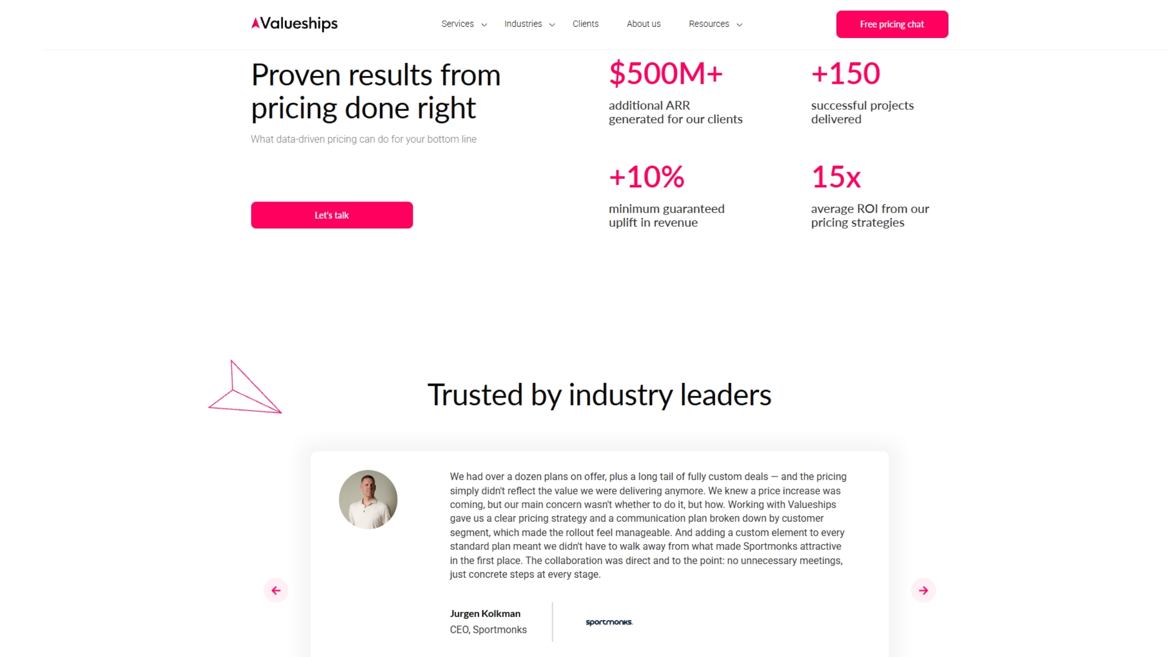
When we rebuilt Valueships' site, proof placement was one of the two changes that moved the numbers. Average time per active user rose 84%, and their average position in Google Search Console climbed 31.5 places, in about four weeks.
"They took our content and made it easy to follow... The Resource Hub works, the paths are clear, and our team finally trusts the numbers."
- Aleksandra Romańczyk, Head of Growth, Valueships
Put a competitor's logo on your page. If the sentences would still be true, they are not good copy yet. Run that check on every line above the fold. Most B2B homepages fail it three or four times, and the lines that fail are the ones doing no work for you.
Trusted by leading enterprises
This copy fails. Every company on your buyer's shortlist could state that.
Trusted by 14 of the 50 largest UK housing associations
This copy succeeds. A competitor would have to lie to copy it, and a reader in that sector knows in one second whether you mean them.
That usually happens because nobody has decided what the company does differently, so the writer reaches for words any competitor could use. Settle what only you can claim first. The specific version will sound smaller than the vague one, and it will do more work.
Turning features into outcomes is a wider topic than one section of this blog post can hold. If you want the full method, we wrote it up in our messaging framework post. What matters here is the logo test you run on your website.
A section that wraps up neatly gives the reader permission to stop reading. End each one on an open loop instead - raise a question the next section answers, or make a claim you have not proved yet. The reader keeps scrolling because something is still open.
Then give the page one primary call to action, phrased identically everywhere it appears, plus one low-commitment secondary for people who are not ready. Nine different CTA phrasings on one page is nine different decisions, and a reader facing nine decisions makes none of them.
By the time a buyer reaches your CTA they have already built a shortlist, and everyone in your category sounds the same to them. A button that says what actually happens after the click is enough to stand out.
Run these four checks before the page goes to build. Acting on each one is cheaper at the wireframe stage than after a developer has spent a week building the page in the wrong order. None of them need budget or traffic.
You can also show the draft to ten real buyers from your category and ask what they think you sell. You will learn more from their answers than from an A/B test.
B2B websites often become hard to follow for four reasons.
Start by defining what the page should achieve and what your buyer already knows. Use headings that make sense on their own. Place evidence next to the claims it supports. Replace generic statements with details specific to your business. Give readers one clear next step. Before development begins, skim the page to check whether the headings explain the offer and why it matters.
If your site has the right message in the wrong order, that is what our content strategy and brand strategy teams do. You can see what that looked like for Valueships, GRAFIT and Snowstack, or talk to us about your own page.